Wednesday, March 23, 2016

Compose Your Frame

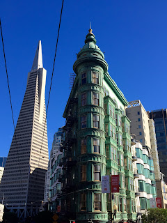
Last semester I had the opportunity to spend some time in one of the most fascinating cities I've ever been to, San Fransisco. My team and I took a bus tour around the city and the number of intriguing frames available there were countless. The one that was my favorite of the day though was a picture I took of the Columbus Tower with the Transamerica Pyramid in the background. 

There are many compositional aspects to this photo, but the most striking is by far is the diagonal rule. The Columbus Tower jettisons out of the frame front and center to create depth. Similarly yet conversely the trolley cables take your eye away from the foreground and draw attention to the Transamerica Pyramid in the background. 

The Transamerica it's self uses its pyramid shape to lengthen the frame, giving a hint towards the sheer magnitude of the city. This is a great example of a graphic vector as the lines draw the eyes upwards and gives perspective to the frame. 

The rule of thirds is apparent in the proportion of the Transamerica (1/3) to the Columbus and the continuation of buildings attached (2/3). This makes it aesthetically pleasing to the eye and proportionally sound.

Overall the image gives an impressive yet pleasing message, a frame that is imposing and inviting at the same time.


Thursday, March 17, 2016

Axioms of Web Design

 
The website that I chose is one of my favorites, the official website of Star Wars. It's nerd heaven and looks good too. It appeals to a sense of order and depth through it's task bar with countless portals to information. The grid lays out nicely so that what needs to be seen can be seen, but the gutters are kept clean and equidistant. As the eye moves from left to right, the visitor sees more options, which is a good way to keep the more in depth fan intrigued for a longer time. The Star Wars website is intuitive enough in it's lay out so that the first time user or brand new fan can navigate it easily. Obviously the point of the website is to showcase and promote Star Wars, which Admiral Ackbar and the bold Star Wars logo do well right off the bat on the banner. Overall for it's audience it is pleasing to the eye and versatile from device to device. The Star Wars website is a wonderful and pleasing escape from life and the realities of this galaxy.

Monday, February 8, 2016

Design Presentation


I love food. All kinds of food. One of my favorite versatile foods are granola bars. I decided to take a look at a few granola bar advertisements. Surprisingly, one of my favorite brands did not make the design cut with their advertisement. 

Nature Valley falls short in harmony, cognitive and contrast. For starters, the green on green provides almost no contrast and creates a blob of  color and no distinguishable palate. While the brand is very distinguishable, it is diminished by being placed on the pencil, and further confused by the tag line underneath with is removed from the overall idea of the granola bar. Altogether the minimalism leaves this ad feeling flat.


 Kashi on the other hand manages to produce an advertisement that has balance, harmony and creates an affective response. This ad clearly displays what the product is and what it contains, which, for a food product is essential in my opinion. The layout is balanced and pleasing to the eye through the display of ingredients. 


Thursday, January 28, 2016

Doughnut Peaches


These are doughnut peaches. As if I didn't like doughnuts enough already, they went and named a peach after them. And the result is delicious. The peaches are firm, almost like an apple, yet surprisingly smooth in texture. The inherent sweetness of the fruit is strong but expected when its name is considered. 

These specific doughnut peaches were found in Seattle at Pike Place Market when I went to visit my best friend. We had been walking around all day when these little gems called our names and naturally we had to have them. We were tired and hungry from a day in the city and their fresh, juicy sweetness provided quite the refreshing contrast to the hard brick streets below our feet. Their varying colors and bright, natural appeal were visibly opposite to the city that surrounded them. In a place where things were metered out, where space was limited and used to it's fullest extent, these short, squatty, round little orbs were perfectly imperfect and even a little misshapen (see upper left peach). The asymmetrical balance between these peaches and their environment was stark, though not displeasing. 

The beauty of this picture partly lies in the day it was taken. It was an unforgettable day. But the harmony of it is what brings it all together. Two left hands press together to hold what one alone could not, while the skin tones blend together as if belonging to one individual. The unity and camaraderie depicted is a glimpse at something much deeper, a friendship and love that has withstood distance and time apart. It is an appreciation of the little things, the time that can be spent together and the beautiful truth that even when life is harsh there is refreshment with those we love.

Monday, January 18, 2016

Hobble Creek #5

Over this past summer I was employed at my favorite golf course in Utah, Hobble Creek. Tucked away in a canyon just outside of Springville, it is by many considered the most picturesque and well designed course in the state. 
Hobble Creek is always packed, especially in the morning, so to play early you have to be there before dawn. To me, the 4:27 wake up time was always worth the experience.

This is a picture of hole #5 taken at approximately 5:45 in the morning. 

I wanted to capture the feeling of the morning, of all of the mornings where I was able to go out with just me, my clubs and a hot cup of coffee steaming in the chill morning air. The untouched dew on the fairway and green echoed the newness of the day, with so many possibilities. Regardless of the quality of golf played it was impossible to be in a bad mood when surrounded by so much serenity. 

The design of the course it's self is stunning. At first #5 can seem straightforward and boring. But after a summer of getting to know it the character of it came alive through the curvature of the fairway as it slowly winds from left to right and tucks it's green securely behind a sand trap. The trees lining the fairway give a sense of security and depth as the surrounding mountains focus the eye on the comparatively dwarfed course.

This particular moment caused a catch in my chest, just left of center. The rose sunrise that slowly faded through strawberry blond rays to the pale blue of the morning sky and the incredible blessing of being there, in that moment left my heart full to overflowing. It had all been designed for beauty, for enjoyment, seemingly for this very moment. For me. 

Hello Friends

Life is such an amazing string of moments. For me, learning has produced some of the greatest experiences of my life, both inside and outside of the classroom, and I'm so excited to share this last semester with you. 

A few good things to know about me are that I love relationships (with people, with God and with my mini Australian Sheppard Moki), I am wholly dedicated to the Green Bay Packers and I do my best work when given a strong Americano and doughnuts. So now you know.