Axioms of Web Design
-
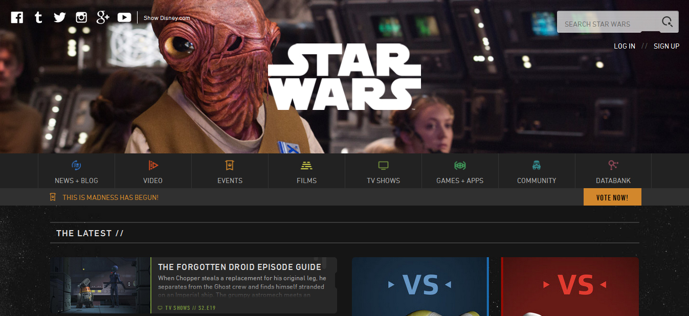
- The website that I chose is one of my favorites, the official website of Star Wars. It's nerd heaven and looks good too. It appeals to a sense of order and depth through it's task bar with countless portals to information. The grid lays out nicely so that what needs to be seen can be seen, but the gutters are kept clean and equidistant. As the eye moves from left to right, the visitor sees more options, which is a good way to keep the more in depth fan intrigued for a longer time. The Star Wars website is intuitive enough in it's lay out so that the first time user or brand new fan can navigate it easily. Obviously the point of the website is to showcase and promote Star Wars, which Admiral Ackbar and the bold Star Wars logo do well right off the bat on the banner. Overall for it's audience it is pleasing to the eye and versatile from device to device. The Star Wars website is a wonderful and pleasing escape from life and the realities of this galaxy.
No comments:
Post a Comment